Product Design Analysis | Difference Asterix
Games in This Video
7 games are featured in this video — they unlock as you watch.




Transcript
I requested a review copy of Difference Asterix from the distributor along with a few other Gigamic games because I wanted to get to know their new look range of small boxed games. It's always been on my bucket list to get a game published by Gigamic, so maybe this could be the line for me. Thanks to Hachette Board Games UK for the review copy. Place a card featuring a colorful scene from the world of Asterix at the center of the table and then distribute one matching card to each player. Well, almost matching. Every card features exactly two differences from every other card. It's a race to spot the differences on your own card before your opponents spot the differences on theirs. The classic children's puzzle of spot the difference packaged as a competitive card game and that is the hook.
I'm Adam Porter. I'm a game designer and occasional reviewer and I use published games as case studies to explore the connection between product design, player experience, and commercial success. I'm also a lifelong fan of Asterix the Gaul and I've covered several of his board game outings on this channel over the years including the slightly lackluster Asterix and Obelix The Big Adventure from Pegasus Spiele, the brilliant route building game Caesar's Empire from Holy Grail Games,
and the recent excellent lane battler Asterix and Co from Matagot. This won't be a typical YouTube review. Rather than simply asking whether Difference Asterix is good, I'll be using a series of product design tools to explore who it's for, where it sits in the market, and why it succeeds or fails. If you're interested in these frameworks, I discuss them in much greater detail in my Admin Weasel's game design books which are available now on Amazon worldwide. See the link in the video description. Difference Asterix is the third iteration of this basic concept from Gigamic and the first with an intellectual property Asterix and Obelix attached. I've owned the previous two titles Difference and Difference Junior for several years and I think they're really attractive little products. The rule set is the same in each of them, but the different pictures add variety, and obviously the junior edition is easier than the original. Each box contains four different images with 25 copies of each, so in a single session, you'll only use one set of images, leaving the others in the box for a future game.
Difference is the brainchild of prolific board game designer Christoph Bolinger, who is primarily known for creating Dungeon Twister, Earth Reborn, and Archipelago. Difference can be played by two to six players age six and up, and it takes about 20 minutes to play as players work to rid themselves of all their cards by identifying differences on each of them in sequence. So, I'll start my analysis as always with the box. Having owned earlier entries in the series, I have the opportunity to compare the old and the new packaging directly. So, the original tins were bright and colorful and distinctive, but the redesign does give Gigamic's family of accessible card games a stronger visual identity. Lined up together on the shelf, they look fantastic.
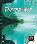
One of the great strengths of the Difference series is its artwork, and the box cover showcases that perfectly. It reproduces one of the game's illustrated scenes, and it simply circles a few of the hidden differences. Combined with the title, it leaves potential customers in no doubt about what the game involves. Everybody recognizes the classic spot the difference puzzle from children's comics, magazines, and puzzle books.
Difference is essentially that familiar activity transformed into a competitive card game. It's a surprisingly sensible starting point for a designer. Take an activity, build a game around it. That familiarity gives Difference an enormous advantage when it comes to onboarding. So, onboarding is the process by which somebody discovers a game, learns it, plays for the first time, and ultimately decides whether to return to it. With Difference, most players already understand the core activity before the rule book's even opened. In fact, you could hand two cards to a child and they will immediately start playing. The formal rules simply add structure, competition, and a victory condition to something that people instinctively know how to do. The onboarding process is helped further by the game's resemblance to another hugely successful French design, Dobble, which is also known as Spot It in the US. And this received its own Asterix edition back in 2023.
In Dobble, players race to identify the single matching symbol shared by two cards. In Difference, every element matches except for two, and players race to identify those discrepancies instead. The underlying mathematics required to create these card sets is completely beyond me, so credit to the designers for making it work. But from a player's perspective, the conceptual leap from Dobble to Difference is a very small one, making the game exceptionally easy to learn and teach. My ladder engagement model looks at five things that tend to keep players engaged: theme, interaction, tension, feedback, and meaningful choices. And very few games score highly in every category, but they don't need to. The goal is to top the ladder with a score of 10 or above. Difference makes no attempt at thematic immersion. The illustrations are charming, but they could depict almost anything. They exist to facilitate the puzzle rather than to establish a setting or tell a story or evoke a world. As a result, it scores zero out of three for theme.
Player interaction is also fairly limited. At its heart, Difference is a race. Everyone is searching the same central card for discrepancies, but each player is comparing it against a different personal card. You're certainly competing against your opponents, but there's very little direct interaction between players beyond the pressure created by their presence. So I'm going to score it one out of three. Speed reaction games usually generate tension quite naturally, but Difference takes a gentler approach than many of its peers. In the closely related Dobble, players are hunting for a single matching symbol against a clean white background, which often leads to rapid split-second victories. Difference asks players to do the opposite. Locate two missing elements hidden within a detailed busy illustration.
It's interesting how much this simple reversal changes the experience. So, Dobble is frantic and chaotic. Difference is calm, almost cerebral. There is tension here, but less than in many games from the speed reaction genre. Feedback describes the ways in which a game responds to players' actions, rewards, punishments, and other signals that encourage continued play. In Difference, every successful discovery immediately advances you towards victory by allowing you to discard a card. It's a simple feedback loop, and it's very limited in its scope, but it works. Players are constantly making visible progress, and that progress is easy for everyone around the table to understand. Meaningful choices are perhaps the hardest category to assess here, because Difference contains almost no decision-making. There's no strategy to optimize, no alternate path to victory. There's very little room for planning, yet neither is the game dependent on luck. Success is almost entirely driven by observation and visual processing. The most skilled player will usually prevail, and I think that deserves some recognition. So, I'm scoring it one out of three. And that produces a total score of five out of 15, which sounds rather underwhelming, but in fact, it exposes a limitation of the model itself. Difference is more engaging than that number suggests. What this exercise reveals is not that the game fails to engage players, but that it achieves that engagement through
means that sit largely outside of my framework. But, if the game isn't succeeding through theme, interaction, tension, feedback, or decision-making, what exactly is driving its appeal? Why has it remained an evergreen seller for Gigamic enough to justify two sequels? Well, the rest of this review should hopefully help to answer that question. So, to understand why Difference has endured, I'm going to use two of my own product design tools. The DICE model helps to identify which parts of a game are simply functional, which parts improve the player experience, and which parts actually drive sales. And then I'll use my meta-hooks framework to pinpoint exactly where the game's appeal comes from. So, D in DICE stands for default.
These are the unremarkable aspects of a game, the information a retailer might list in a catalog, but which rarely convince anyone to make a purchase. So, Difference * is a small-box card game for two to five players, playable in around 20 minutes. These are useful facts, certainly, but they're hardly the reason that people pick up the box. I is for invisible. So, these are the design decisions that make the game work, but which most players never consciously notice. One example is the elegant gameplay loop. Whenever a player correctly identifies the differences on their card, that card becomes the new central reference point for everyone else, and the game therefore flows continuously without pauses to reset, shuffle, or to tally scores. Players are always comparing one familiar image against one unfamiliar image, ensuring that nobody gains an advantage simply through familiarity. Another invisible design choice is the card construction itself. By printing illustrations on both sides, the designers can include four unique images across a relatively small deck. So, that keeps production costs under control while allowing the cards themselves to be oversized, which is essential for an observation game where visual clarity is paramount. The result is a compact product that still feels premium when you hold it in your hand.
C is for core. So, these are the elements that players actively notice and appreciate. In Difference, the obvious candidate is the artwork. The illustrations are lavish, colorful, and packed with detail rivaling games like Dixit in their visual appeal. Even players who have little interest in the underlying puzzle can appreciate the quality of the illustrations. E is for edge. So, this is the feature that defines the product. The thing players mention to friends. The reason someone chooses this game over another. And for Difference, that's easy. It's spot-the-difference transformed into a competitive race. In the case of this edition, the Asterix license adds a second layer of appeal bringing a familiar cast of characters to an already proven formula.
So, that naturally leads into my meta hooks framework, which breaks a game's appeal into four domains: mechanical, experiential, thematic, and aesthetic. The mechanical hook is straightforward, competitive spot-the-difference. The game takes a familiar solo puzzle and turns it into a race. The experiential hook is equally clear. Can you spot the difference before everybody else? The game transforms observation into a contest creating just enough pressure to keep players engaged. The thematic hook is relatively weak. Though it is stronger in this edition than in previous versions thanks to the use of the Asterix license. The theme doesn't influence how the game works, but it does provide a familiar and charming backdrop for the puzzles. The aesthetic hook on the other hand is very strong.
Difference is essentially a collection of oversized premium art cards, and the production leans heavily into that strength. There's one final type of hook that Meta deliberately excludes, and that is the contextual hook. So, these are advantages created by factors largely outside of the designer's control. So, in this case, the contextual hook is obvious. The latest entry in Gigamic's long-running and commercially successful Difference series. So, if we combine those hooks into a single sales pitch, we end up with something quite compelling. Competitive spot the difference in a world of Asterix, presented on the lavish oversized cards, and building on Gigamic's long-running Difference line. That's a proposition I can easily imagine appealing to both puzzle enthusiasts and fans of the comic series. And the final product design tool that I'm going to use is my idea execution matrix. So, when assessing an idea, I consider how inspired it is,
how distinct it feels within the market, how engaging the underlying activity is, and how large the potential audience might be. Competitive spot the difference strikes me as a clever idea. Spot the difference puzzles are familiar to almost everyone, so transforming that activity into a multiplayer game feels like a natural step. After all, Scrabble did something similar for crosswords, MicroMacro did it for Where's Wally, and countless games have borrowed from Sudoku and other traditional puzzles.
There is clearly an audience for these activities, so it makes sense to ask whether they can be turned into games. Difference doesn't quite reach the top of the idea axis, however. The activity is inherently narrow. Players are always performing the same task, and while it is enjoyable, it's more gentle than exhilarating. As discussed earlier, the engagement comes from concentration and observation, rather than excitement or dramatic moments. Now, execution looks not only at the publisher's presentation, but also at the designer's choices and how effectively they shape the player experience. The artwork is beautiful. Gigamic could easily have produced illustrations resembling those found in children's puzzle books, but instead, they've invested in lavish, richly detailed scenes that elevate the entire product.
The gameplay loop is equally smooth. Each successful card immediately becomes the new reference point for the next comparison, creating a seamless flow with almost no downtime or administrative overhead, and learning the game is a breeze. My one reservation
concerns replayability. The challenge with highly detailed illustrations is that the differences themselves become memorable. After enough plays, the game gradually shifts from an exercise in observation to one of memory. And this is quite different from a game like Dobble, where memorizing individual cards provides little advantage. Difference does mitigate the problem by including four illustrations per box and 12 across the three currently available editions, but it remains a limitation of the system. If played heavily, the game benefits from being left on the shelf for a few weeks or months before returning to it with fresh eyes. Taking all of this into account, Difference lands comfortably in the yellow region of my matrix. A strong idea executed extremely well. The very best products occupy the red section at the top right, where exceptional ideas meet flawless execution, while weaker products drift towards the blue section in the bottom left. And the yellow is a healthy place to be, and it's one that suggests long-term commercial appeal.
Overall, I would recommend the Difference games to families looking for a relaxed, accessible activity that can be brought out from time to time. They're unlikely to become the centerpiece of an entire game night, but they do make excellent fillers, travel games, or coffee table distractions. And for fans of Asterix in particular, this latest edition has an additional charm, which made it particularly irresistible to me. So, if you're interested in the product design tools used throughout this review, you'll find them explored in much greater detail in my Adam Wells game design books, especially my board game designer journal and Adam Wells product design. All of my books are available on Amazon worldwide, so check out the links in the description to this video.