How to make a board game which demands attention!!! *Board game design* * Product Design*
Games in This Video
9 games are featured in this video — they unlock as you watch.






Transcript
the aesthetic appeal of a product plays a big part in its commercial success and board games are very well placed to showcase many pieces of beautiful art indeed they are uniquely placed to flesh out entire worlds with the wide variety of components which this art can adorn within a single package i'm adam porter i'm a board game inventor based out of cardiff in wales and in my recent videos i've been trying to break down the key facets of product design the way a product looks is one of the most important factors in determining whether that product gets purchased and whether it's enjoyed by the purchaser once they start using it focusing in on board games the visual appeal is massively important in determining commercial success but it's a tricky area for me to dive into because unless a designer is self-publishing their game they have very little input into the presentation of the product generally the look of a game is determined by the publisher and this is the reason that board game designers are frequently given the very wise advice not to spend money on art when making prototype games placeholder art is more than adequate to give publishers a feel for what the game could look like in its finished form publishers are likely to discard any artworks you put in place and commission their own to ensure that the game fits into their brand perhaps it's worth elaborating on that point how much input should you expect into the look of your game when it's under development with a publisher well i've had a variety of experiences across my published games and in most cases
publishers have showed me image along the way and asked my opinion but i haven't felt empowered to make substantial changes i've generally felt able to suggest a minor tweak here or there and the truth is that by the time a publisher is showing you artwork they've usually already invested a lot of time and money into it and making substantial changes is going to be costly to them i'm sure that most publishers would accommodate a designer's wishes if they were forceful and perhaps i'm too conflict averse but i think it's always worth balancing your request against any potential damage to a future relationship with that publisher however before you click away from this video thinking well if it's all down to the publisher i don't need to worry about this stuff i would say hang on don't go there are a few things you need to be considering even in the early stages of the board game design process the most important thing is that designers need to understand what board games look like in 2021 and what players expect you should have an idea of what your game could look like even if you're not in a position to totally realize that vision without a publisher's help i've sometimes made mood boards to demonstrate to a publisher the sort of style of artwork i'm thinking of for my game how it might look when it reaches its final production a mood board is a collage of images photographs colours patterns and drawings i might incorporate images from films and books and paintings all which share a common feel with my game you could think of it as a printed version of a pinterest page to get a feel for the evolution of board
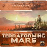
game art let's take a look at the shifting styles of box covers over the last few decades so if we start with strategy games which came to the fore in the late 1990s at the time these were often referred to as german games but over time they became known as euro games 20 years ago publishers of these games were keen to separate their products from children's toys so we had covers like these the clear intent was to declare that these were serious products for adults ten years on not much had changed we still had bored historical guys looking into blank space or amateurish line drawings and drab colors at this point days of wonder were flying high generally regarded as having the best presentation in the business for most companies this quality of artwork and component quality was considered unachievable but if we push on another 10 years we can see how much has changed days of wonder levels of production are considered the norm in 2021 and are frequently exceeded even by first-time publishers using crowdfunding platforms publishers are no longer afraid of looking childish they recognize that adults enjoy fanciful settings like woodland critters just as much as children do i recall pitching a space themed euro game to publishers in 2015 and being told by multiple different publishers that players of eurogames were just not interested in that theme i suspect the success of terraforming mars has permanently buried that
particular piece of groupthink which was circulating in the industry at the time looking at the industry from a totally different angle even party games seem to have overhauled their presentation once seen as a frivolous and cheap form of board game in 2021 party games have slick graphic design and often quite beautiful components thematic games have always been ahead of the curve with their visuals looking back 30 years games had incredible pieces of art emblazoned on their box covers 20 years ago the art was sometimes a little rough around the edges but it always looked bright and characterful looking back 10 years the artwork was outstanding if a little busy and it wasn't notably different to the sort of art we see on high fantasy games today and in 2021 we end up with crisp clean design like this all three of these games are hybrid games they're not easily categorized because they feature strategic gameplay of the type seen in eurostar games while also using fantastical settings and combat mechanisms and other hallmarks of american style thematic games hero quest had a surprise relaunch this year three decades after its original release hasbro took a new direction with the artwork keeping it near identical in composition but overhauling it entirely to give it a more modern style it gives us the rare opportunity to contrast two very similar images put together 30 years apart and consider how much our tastes have changed let me know in the comments which art style you
prefer it might be tempting to look at all this and draw the conclusion that in 2021 when it comes to theme anything goes but i would once again caution you to hang on not so fast i talked recently about innovation and how sometimes consumers are reluctant to embrace bold new ideas and i think this is true for theme as much as it is for mechanisms i'm a dentist and i'm frequently asked by play testers by other designers and even publishers why don't i create a game all about dentistry seriously i get asked it all the time and the truth is that nobody wants that nobody wants to play that it's not fun though i must admit i am intrigued to try battle dentile from small furry games which has a tooth fairy and a goblin competing to gather the most valuable teeth from a human skull unless it's a party game or a themeless abstract when i look at a game ideally i want to know what my role is what simulated actions i'm going to be undertaking and how the game is going to make me feel this is easier to convey if the theme is familiar i'm a farmer great i'm a doctor okay i'm a zookeeper awesome i think the box covers for roxly's steampunk rally games are on point they tell me who i am and what i'll be doing and the faces convey emotion too some games don't have the same clarity of vision skylands is a favorite of my wife and mine but the artwork is jarring what am i am i a goblin well what do
they do am i a dragon rider i mean what sort of game is this oh you're building cities in the sky why are they in the sky how does that relate to the gameplay what am i supposed to be feeling here why couldn't they be cities on the ground like in the original version king of frontier i love skylands despite its odd theme if you haven't played it you should absolutely check it out but it disappeared without a trace after launch i suspect the confusing setting had a part to play here i have nothing against fantastical themes i'm totally intrigued by ryan lockett's sleeping gods for example but a fantastical theme brings with it the expectation of a strong story a well thought out world despite its fun tire laying puzzle skyland's had none of this if a game has no narrative it's going to be easier for players to adopt if it has a familiar setting if you want something a little more colorful well archetypes are fine we all know wind in the willows many people will have played with sylvanian families as a child lots of us enjoyed reading red wall books even though the game would function perfectly well in a human environment everedel's woodland setting absolutely falls within the realms of the familiar speaking of evidel this game features one element which designers might consider utilizing when devising their own game the standout component everdell's cardboard tree is irrelevant to gameplay indeed it even hampers gameplay by obscuring players vision of the board but it is very appealing
giving the game immense table presence and a distinct visual identity in pitch meetings over the years several publishers have mentioned to me that a standout component is very desirable in a prototype stonemaier games mention in their submission criteria that they are actively looking for games with exciting components the bird box dice tower in stonemar's wingspan is equally as irrelevant and yet every bit as iconic as everdale's tree i don't know whether the evidel tree or the wingspan bird box were imagined by the designer or by the publisher but in some cases the component is so pivotal to gameplay it has to have been a designer's invention among my own designs i would credit picoco's cardholders as just such a component they are pivotal to the design and the game has great table presence as a result in zulkin you place workers onto plastic gears and later take an action when you remove the worker but the longer the worker remains in place the further they'll travel when the gears rotate giving you access to better and better rewards it's a great look and it's a fantastic gameplay mechanism horrible guild had great success with the very beautiful and tactile marble dispensers in potion explosion they followed the game with razer goblets which featured a plastic goblet for each player to hide tokens in in repost productions cache and guns players point foam guns at each other to determine who gets shot and who survives to take a share of a collective pot of money and it's not just customers who love a
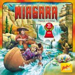
fancy component the spielder's yares jury seems to be drawn to them too the 2005 winner niagara had an ingenious river mechanism with transparent plastic discs which shifted the players boats as they moved with the current the 2015 winner cult express made a huge feature of its 3d train with robbers battling each other as they moved from coach to coach the 2014 winner camel up features a pyramid-shaped dice shaker and wooden camels which stack on top of each other i was recently impressed by the visual presentation of the game wild serengeti i was looking at the tile laying game new york zoo and contemplating how animal-shaped tokens known in game and jargon as anime pools were really rather underutilized considering their obvious aesthetic appeal i daydreamed of a game full of wonderful and diverse animals in their natural habitat i then saw photos of wild serengeti on instagram and i was immediately drawn in this looks beautiful exactly what i was imagining i have no idea whether the gameplay is any good but the table presence looks outstanding if you can identify a clever and functional component which would give your game a unique visual identity this could form part of the hook which attracts a publisher and ultimately this could be a core selling point for your game i should advise caution here though components can be costly and unusual items may be off-putting to publishers in the current climate of shipping delays escalating costs backlogs in
factories and cardboard shortages it's very hard to determine what games will look like over the next few years as publishers navigate this strange new world as a game inventor the visuals are unlikely to be at the forefront of your mind when you're ideating prototyping and testing your game and i think this is as it should be if you're focusing too much on your visuals at this early stage it's probably a distraction from the important gameplay elements which might need your attention if you pin down artwork too early even placeholder art you can become very attached to it and it can make you reluctant to change your design when necessary which will be frequently if you're playtesting your game as rigorously as you should be but it is wise to have a general sense of how the game might eventually look even in these early stages and identifying a standout component early on might even allow you to shape your game around it to make it a core feature of the game let me know in the comments which games have gone above and beyond with their aesthetics and some examples of games with unique standout components thanks for watching and i'll see you next time