Ranking 50 MORE Board Game Covers - from the BGG top 100 (50-1)
Games in This Video
21 games are featured in this video — they unlock as you watch.




Transcript
i recently made a video looking at 50 different board games and ranking them on the basis of their box covers and we chose the bottom 50 of the board game geek top 100 games arbitrary choice of games really but i thought then we could pick apart these box covers look at the promises they make to us and do they deliver do they make it look exciting do they sell the game that's what a great box cover should do shouldn't it should tell us what we're doing in the game and even more importantly how we're going to feel i'm adam porter i'm a board game designer and board game reviewer you've probably watched some of my other videos on this channel i hope if you haven't please go back and watch them there's loads on there please subscribe if you enjoy the video and comment let me know what you think of what i'm saying here i'm probably going to be a little bit irreverent a little bit disrespectful about some of your favorite games i'm sorry it's only the box cover i haven't played a lot of these games i've played about 50 of the board game geek top 100.
so let's get stuck straight in and look at number 50 which is power grid i find it hard with this one because it's such an iconic cover and i really like it like it's stylishly drawn but do they i mean how boring do they want to make this this this look you know i like the green the use of green in this one's good i've moaned about green games in the previous list this is a nice use of green but we've got our avatar here our in-game persona is this man with the clipboard turning a dial and looking bored with a certain tie that's not what the game's about the game is all about um money making loads of money and exciting deals and auctions and all that sort of stuff there was an alternative cover um i've got in my collection actually which was for power grid deluxe i mean this one's even worse frankly i don't like this one at all this is like homer simpson isn't it just a man asleep in a power plant it should be telling us how we feel it shouldn't be so literal okay i i i'm not going for it we'll rate the first one we'll ignore this second one we'll rate the first one and i'm calling that one a beat here and i'm allowing it b rather than a d here because it's iconic yeah it is at least a really eye-catching sort of design it's it's it's a classic it's a classic right number 49 zulkin the mayan calendar
yeah i like this one actually i do quite like this one the the guy holding up the skull there it's quite striking um not quite sure what i'm doing although we've got that dial in the background which kind of hints at what goes on in the game um i think maybe more could have been made with the dials because that's your big selling point in this game isn't it those turning cogs maybe we wanted to see a little bit more about that a lot of it's about time this game nonetheless it's a strong striking box cover i'm going to call this one a b-tier next up then is anachrony i don't know what anacrony's about no i don't i don't know anything about it what does this cover tell me nothing really it's white it's got a symbol on it i'm getting nothing i'm getting nothing from it it's utterly forgettable i no i'm going to detail i don't even know what it is box cover should at least tell me what i'm gonna be doing in the game the crew the quest for planet nine i loved the earlier crew game we talked about the crew deep sea one um on the previous list um but this one at number 47 don't like it quite as much they're going for the same thing i guess this was the first one wasn't it that black outline with a a lighter blue in the middle and so i suppose it's quite nice that the two kind of have a similar feel even though one's underwater and one's up in space um but i think that the the space theme is less intriguing than the underwater theme and actually i think it's more nicely drawn the previous one this one
i'm going c tier c2 i think it's a bit boring really uh number 46 mountains of madness second edition fantasy flight are just great at these covers i i mean i really sang their praises in the previous video i'm not even a fantasy flight fan i don't like many of their games and i don't like mountains of madness but this cover is great it's great i remember before i got into board games uh the modern board game sort of hobby i went into the board game shop for the first time ever going into a board game shop and mansions of madness was the one i pulled off the shelf and that was the first edition um but the cover was just so enticing you know just this this sort of haunted house so um yeah this is really good estee i like this spooky old house manchester's second edition written in the font that i can barely read on this dark purple don't know what it's all about from the cover tells me nothing it's like an acronym i'm getting nothing from it it's stylish but why would i look at this i i don't even know what it is sorry no this is a detail detail for pax paneer number 44 pandemic legacy season two and i was very impressed with pandemic legacy season zero's artwork in the previous list so let's have a look at pandem's pandemic legacy season two again i really like the composition of it um i i like the um yeah i like the avatars on here the
masks and the you know it almost looks post-apocalyptic is it post-apocalyptic i don't know that's kind of what i'm getting from it with the almost steam punky the the goggles and all that stuff going on there i like the horizontal box um and the warships and all of that again it looks very much like a film like a movie poster really good um i don't think it's quite as good as the pandemic legacy season zero box but nonetheless i think this is still an s here really really top-notch stuff pandemic does great box covers okay next up then at number 43 is underwater cities which is a great title right underwater cities fantastic title fantastic theme and the box cover's not great is it really i'm not even sure what i'm looking at is that a person no it's not a person is it it's a submarine and then we've got a couple of swimmers down there i prefer the box cover to the crew that underwater crew one this looks half-assed really i'm going um c c tier for underwater cities next up then maracaibo okay yeah it's it i mean there's a bit of adventuring is there into a forest and there's a ship on the sea at the top there um but really it's mainly that that title takes up the whole thing so if you don't know what maracaibo means then you're not getting much from it proceed here yeah let's see tier for maracaibo
i'm not too impressed with that one agricola again we've already talked about agricola previously and i don't think this is much different to the yeah it's very similar to the revised edition that we talked about previously just with slightly um i think that they redid the the artwork to give it a bit more depth or something like that in a revised edition we've got the same framing issues that we had um i don't know what i gave it last time but this time it's annoying me so i'm giving it a detail okay number 40 barrage don't know what this is who's it by bash nope still can't read oh simone luciani again i mean it's very gray isn't it the lightning gives it a little bit of spice to it and there's some biplanes in the background there but you've really got to look close to spot all that stuff it all looks a little bit industrial i mean it's beautifully drawn and the composition's nice but it's not really intriguing me looks a bit dull and i'm sure the game isn't but it looks a bit dull so i'm going to go c maybe a b because it is beautifully drawn let's see it doesn't tell me what i'm doing or how i'm going to feel playing the game it's c tier too many bones a dice builder rpg with this weird little gobliny character at the bottom there i don't know what you can see here i'm not that well up on many of these hot games am i i don't like the composition don't like the i mean it just looks like a generic fantasy doesn't it
is it under water is that what's going on here i don't know i don't think it's very good the box cover there i'll go see seed here for too many bones a dice builder rpg blood rage blood ranger number 38 i think this is a great box cover this is not a cover that would appeal to me okay i'm not drawn in to play hugely violent games full of vikings but that's what this this game says rage and violence and blood like no other okay we got the flames we got the viking running out there with his axe he's ready to slice us and we've got the skull up there covered in blood right in the center and swords crossed a stunning stunning cover this has got to have helped sail surely this is estee this is fantastic stuff but it's not going to make me play the game whereas the next one i've actually just ordered my copy so this is obviously working for me arc nova i like the green i like the blue i think it's very striking i like that sort of pattern that artwork that modern sort of look um strange that you know this has got photo realistic photographic indeed artwork on it i think these are photographs on the cover these aren't paintings i know in the game that it's photographs all the way and that doesn't really appeal to me i'd much rather have drawings but the composition of it is lovely um this sort of globe it all looks very futuristic and modern and and i think this box is yeah it's intriguing it draws me right in um
i think i think it's lovely i think this is a um a here number 36 is marvel champions the card game this could be any marvel game um we've got spider-man at the center and captain america and that's about as many as i could name um but nonetheless oh there's thanos in the background i know thanos black panther is not there maybe is that an iron man i do know a few of them i do know a few of them um it's good it's dynamic it's uh it you know doesn't really tell us what we're going to be doing aside from that this is a game about marvel people marvel champions presumably so i have no idea what i'm actually doing in the game but it's beautifully drawn i guess you need to once you're making marvel games and the same with star wars games and lord of the rings games you start to need to differentiate one product from another and i'm not sure it's managing that so i'm going to call it b tier be to you probably unfair because i was really full of praise for imperial assault wasn't i previously right next up number 35 caverna the cave farmers well this is a reworking of agriculture isn't it this game and they've gone for the same framing with but now with brown instead of that dull orange so i don't like that the brown i do like that we've zoomed in a bit okay because i think a lot of those uh uber rosenberg lookout games are two zoomed out so we've zoomed
in and we've now got our avatar this uh this female dwarf i i think she is and the donkey up at the center not particularly exciting though is it the only emotion on this cover at a sheep in the donkey they're grilling at us whereas the woman who's making the food she doesn't look very interested does she again i want to be the donkey i want to be the sheep if i'm playing this game you don't get to be them i played it good game not a great cover okay uh next up is number 34 puerto rico proper old school box here an alia box oh these boxes were a mess weren't they and they're still producing them in this format what is going on with this framing there i mean the ravensburger slash at the bottom there doesn't particularly help but at least that's iconic and it's a mark of quality but for some reason they've then pushed the picture off center and i'm not even sure what that picture is it's kind of cut off we've got a is that finger on the left i don't even know what it's holding presumably the image is on the side of the box why why is it on the side why not on the front why not both puerto rico off center in this odd font tiny little writing saying andrea sofia and then this odd textured background it's horrendous isn't it this is detailed this is terrible terrible stuff food chain magnate well some ways i think this is how you do it okay it's retro
modern way to old fashioned good gaming right yeah wear that heart on their sleeve says that's what it says on the tin old-fashioned good gaming with old-fashioned good artwork but it's well drawn nice choice of colors um the theme is right there okay with fast food uh running a chain where we've got the woman looking us in the eye great and the man at the bottom there even though he's a little cartoon character he's looking us in the eye as well they're smiling they're enjoying themselves even the pizza is enjoying itself pizza or pie i don't know nonetheless i think this is a quality box cover striking stands out original nicely drawn controversial to say yes here i'm going for it it's nest here for the food chain magnate okay next up lost ruins of arnak at number 32. there's something a little retro about this as well it looks like an old adventure style comic or um picture book or something like that but it's really detailed um the composition's lovely the way that we've got the framing of all those uh branches and vines and then it draws us into our avatars in the center and they're having fun this is not like kayla's looking boring boring dude on the front cover these guys look like they have an amazing time um we've got a nice bit of diversity on the cover which is really really good we've got some intriguing looking buildings that look a bit like dragons and things in the background i like it
so i'm going to go eight here for lost ruins of our knack now we've previously talked about eclipse in its previous edition because that was lower down on the list this is the second edition for eclipse and they've kept some of the stuff that i like about it they've kept the nice um tight face with this sort of slash in the middle of the the solar flare we've got again that arc of the the sun behind a moon or a planet you know everything says eclipse i've lost the sense of who we are or what we're doing though i mean no longer do i know whether we're talking is this a game about the cosmos and planets or is this a game about spaceships or is this game about space battles who are we and what are we supposed to feel yes this is more beautiful and more striking perhaps it doesn't really tell any sort of story this could be any sort of sci-fi game or even not a sci-fi game it could be an abstract game so although it's beautiful it's not quite doing it for me so i'm gonna go see tier for eclipse second dawn for the galaxy mage knight the board game well i said i wanted an avatar here we got it you know exactly who you are on this cover don't you i like the orange color i like the dynamic figures in the background and monsters it looks exciting full of battle i'm gonna go a a tier for mage like the board game probably not a game i'll ever play but i do think the cover sells it well uh we've talked about a previous edition of clank but number 29 we've got clank
legacy acquisitions incorporated and i don't like this cover half as much as the first one why is it so cartoony i haven't played the game i don't know the first one wasn't this cartoon yeah i'm sure it wasn't we've suddenly gone into a very nickelodeon sort of style and that's not what i'm expecting from a legacy version of clank this almost looks like crank junior or something like that i've lost who my avatar is i don't know who i am anymore am i i am i who are the baddies and who are the goodies what are we doing in that first cover we're stealing gold from a dragon it's very clear i don't know what we're doing in this cover yeah i don't like it no c c tier for clank legacy acquisitions incorporated okay we're at number 28 and it's another clements franz bit of artwork this time from dlp games but they've gone for the same sort of styling as lookout spieler here some strange artwork strange proportions on these figures it does look quite striking i don't know i can't get over the sort of naivety of the drawing i really like clemens fran's art style in a way but but this is not really filling me with confidence um everything looks a little bit wonky and out of proportion i'm gonna go um see here for early on well this is how you do it isn't it evidel um beautiful beautiful composition the colors the you know you don't need to make a big deal about the fact that we're woodland creatures but but they're big enough they draw your eyes drawn to them by the colors and the composition we're
straight in on that badger i want to be that badger or i want to be that that little um squirrel carrying the fruits or even the little mouse i want to be one of the butterflies i don't know it's just beautiful i i mean it gives you that red wall feel that that wind in the willows feel you know what you're getting and and the game delivers on it this is uh estear forever this culture essential edition um this is an interesting one because the previous viticulture had exactly the same cover but didn't have the people on it and then in this essential edition they they realized i think that we needed to have an avatar we need to have an in-game persona on the cover to show us what we're going to be doing how we're going to feel and who doesn't want to be like these beautiful italian pear there with their their grapes making wine in this beautiful idyllic landscape i like it and i like the composition of it so i'm going to go bead here for viticulture essential edition next up then is root at number 25 and this is a trick you want to judge isn't it because it's so weird i mean you could look at this and think you're going to be playing a kids game couldn't you for sure and you're not you're going to be playing a war game i believe i haven't played it an asymmetric battle game i think it's really striking i think it's really bold i think it's got all the brand um assets of uh of
this particular publisher um their games all look like this this particular designer in fact their games all look like this and uh and i think there's something quite beautiful about it it's a similar world to what we talked about with everdel isn't it but with so much more of an anarchic sort of stylings to it i think it's great so striking i'm going to give it um s t s there's so much wrong that it's right yeah it breaks so many rules that it just stands out for me so next up at number 24 arkham horror the card game and i've not got to say much about this because i i love it it's the same as eldritch horror and uh you know just fantasy flight does this stuff well people with guns at the center and tentacles and bats in the background it's intriguing it looks horrible and action-packed and i will never play it because i don't really like cthulhu but if i did like cthulhu i'd be thinking yeah this looks great this looks exciting um yeah i think it's really good estea for arkham horror the card game number 23 wingspan est here okay um just gorgeous gorgeous and iconic beautiful beautiful artwork but this particular um image is just gorgeous i talked previously about the game cascadia which was illustrated by beth sobel and how i liked the artwork but
everything seemed off-center and i wasn't clear who i was or how i was supposed to feel about it this is clear this is a game about birds birds birds birds that's all it is and and it's just the composition of this is lovely it's almost like a star on that blue background and the the red really pops um gorgeous absolutely gorgeous estear wingspan right next up a feast for odin from z-man games an uber rosenberg game with clement's friends artwork again i believe is it clement's friend's artwork no it's not it's dennis lohausen well i didn't know that a feast for odin dennis lowhausen artwork um and really beautiful really beautiful i've been critical of some of dennis lowhausen's artwork on these lists so far but this is stunning and i do like a board game cover where it's in the first person where it's me holding that horn full of beer or whatever it is ale um you know that's presumably my hand i haven't seen that on many board game covers what was the other one mombasa i talked about earlier where there was a hand there holding a pen shaped like a feather and it was clear that's my hand i like that it tells me i'm going to be a viking and all the other vikings are saying cheers to me as they lift up their horns as well nice composition it's a bit busy um i love it makes me want to play the game yeah really good a tier for a feast for odin next on the list is number 21 terra mystica yeah this isn't so good this is getting
a little bit old school um it's all border it's all border rather than the actual content i mean what's going on in the content is that a dwarf um we've got a bunch of different sort of terrains but i mean you only know their terrains because you know because i know what terra mystica is i mean they're just like blobs uh in this sort of circle there i think that's really uninspired not a huge fan of that cover at all so i'm going to give that one detail don't like that cover okay number 20 and this is an interesting one because it's a beautiful image and yeah it's so dark i mean you've got to think about how these things are going to look on a phone if you really zoom in you know if you really go small this is going to look like a a smudge but actually when you blow it up brass lancashire really moody isn't it really tells you how you're going to feel this man with his what's he doing what's he got in his hand he's got this little industrial contraption in his hand he looks so so classy with his with his pipe and his top hat and all that smoke and the the red coming i mean it's gorgeous absolutely gorgeous i don't know if it'll catch the eye because it's so dark but it is gorgeous ester i'm calling it este it don't care that you're not going to be able to see it on your phone stunning stunning makes me want to play it i've
never played brass i should i think i'd like it number 19 concordia it's not great is it it's not great oh this is this is the new concordia cover what was the previous one let me see if i can find an earlier version well i mean they've sort of improved it haven't they at least we know who we are we are this woman and she's buying stuff that's it i i i don't know there's some there's a soldier in the background um i don't know what this is all about it's it's yeah it's not doing it for me this one not really it's not very exciting i'm calling this one c tier i don't know what that's about i've played concordia and i still don't know what that's all about next up then is seven wonders duel seven wonders was one of my favorite on the top 50 of the or the bottom 50 rather of the top 100 was one of my favorite box covers and actually this is great because it does all the same stuff it's got those wonders around there the pyramids and the big statue and all that but it's also got this clear two people back to back they're about to go for into a jewel that tells us what we're going to be doing and how we're going to feel tells us there's warfare in this but it's not just about that it's also about the science and technology and building and all those sort of things really nicely framed and and and put together uh gorgeous artwork um i think this is
stunning yep seven wonders duel i'm going st i'm sure these covers are a big part of reason seven wonders is as popular as it is uh number 17 nemesis yeah this is great isn't it a horrible sort of alien um themed game with that that big alien there looks like the alien from the film that just treading that fine line where they're getting away with it and then we're presumably the space man at the bottom they're about to get eaten um again it's dark but it's got enough highlights in it that it works for me yep i'm going este this is a good good looking cover ester probably a game i'll never play number 16 at the castles of burgundy this is an unfortunate one isn't it it's got that horrible ravensburger alia cover again with the off-center image the of a person looking at a landscape and a castle it's a charming enough image but it's just completely swamped by that purple color or off-red mahogany color and then the tiny little stefan feld scrawled at the top pretty poor and then the remake of it that wasn't particularly good either it told me nothing uh nothing at all about the game and then we see that there's a new version coming again another new version and this one actually looks quite nice just in terms of the composition the brightness and the colors it looks modern it looks like a game that you would buy today you know why why publishers still producing those old versions this is what a board game looks like today
so i mean the previous version uh that horrible purple version that's a d tier this new version that's a beat here the one coming up yeah because it doesn't really tell us what we're doing but it is beautifully drawn okay moving on june imperium i i have nothing to say about this the same as with that second edition of eclipse we've just got some planets it doesn't tell me anything else i've not seen june i've not read june so i don't know what it's all about so it's kind of i guess this is kind of hoping that you know what june is all about i don't so for me this could be an abstract game it could be a game about planets it could be a game about space warfare it could be a game about settling these planets i don't know what it's about it's just sci-fi just sci-fi is not really good enough is it um so it's not working for me this one is a seat here tells me nothing and that brings us to number 14 which is one of the best board game covers of all time definitely an s tier and again it's one that doesn't really attract me but definitely this sold many many copies on the basis of this cover alone um those giant mechs and people out you know plowing the sea the fields just getting to work farming around this industrial mechanized thing that i mean the whole game was based around this artwork the artwork came first right that's a rare thing for a game um i mean it is stunning it is beautifully done um but but it didn't didn't particularly attract me nonetheless i'm doing s here just because yeah there's no no debating it this this this sold the game twilight
struggle beautiful cover absolutely love this cover didn't particularly enjoy the game uh which i know is um sacrilegious to say um it just wasn't for me it just just wasn't for me various reasons but the cover's great it looks it's so sort of stark and stylish and stylized and we've got our avatar in the center there we know who we are got so much intrigue to it um yeah i think it's just gripping this cover really really attractive i think this is s tf twilight struggle really really good we're getting there we're getting there number 12 is great western trail the first cover to great western trail is very very gray and washed out and no emotion on the faces of these people and they look slightly artificial it's a bit odd the drawing on this one um i i can understand why they chose to change this cover there's nothing very appealing about it and i know the game was a huge hit um but i can't see that this cover will have done anything for it i mean we know who we are we're a cowboy um presumably um that's about it that's about all i'm getting from this cover really but we're not a wild west shooty shooty cowboy are we we're we're um something a little bit more placid than that second cover much more beautiful um and i think it sells the theme better okay yeah we're we're cowboys in the sense that we're out looking after cows okay yeah again not shooty shooty
cowboys we're cowboys out looking after cows but this is a beautiful image um and it's got framing which sometimes can be a little bit awkward that top and bottom framing with the the widescreen snapshot across the middle but i think it works here because of the really bright colors in the center there that sort of letterbox approach i like it the the second one the first one uh is c tier and the second edition is a beat here beat here for great western trail second edition okay number 11 through the ages a new story of civilization so this is a second edition of through the ages and they have doubled down on putting historical figures on the box that's something i moaned about in the previous edition saying that it made it look educational and i still think that is sort of the case in this one we've got shakespeare here in napoleon and caesar and einstein is a little bit on the nose and i still think a civilization game with seven wonders cover would be better um but nonetheless this does look more modern uh they are nicely drawn now okay it's all right it's okay we'll go beat here be tier for through the ages a new story of civilization i say that through gritted teeth because the first one annoyed me so much not the game the cover uh number 10 war of the ring what epic battles in middle earth okay good it's about battles i'm getting that
we've got a uh a nazgul uh the witch king of angmar i guess that is riding on that fell beast and attacking somebody on a horse um but you've got to look quite close to see that again it's quite brown what is it with these lovely rings games and brown uh framing around all the edges of it um it's quite busy it's hard to spot what's going on i don't love it i don't love it i'm going seat here for war of the ring well this one's colorful bright and colorful and intriguing and i guess if for a game about spirits that works we've got these water creatures and stone creatures and then there's one that's kind of made of what's that grass and earth there's one with a rat on its head one made out of fire yeah i think that's quite beautiful it's quite a beautiful color cover i don't know whether these are the avatars i don't know whether we are the spirits or whether we are fighting the spirits or i mean we're going to an island full of spirits maybe we're the people on these ships it's a cooperative settler destruction strategy game okay right so we are the spirits attacking the settlers i'm guessing that's a nice twist if that's the case then this cover is doing it it's telling me what's going on um an anti-colonization game is that what it is is that what it is i'll have to i'll have to look it up afterwards and find
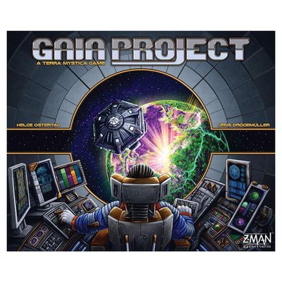
out um i've got friends who've asked me to play this i should i should take them up on it and play spirit island with them um i've avoided it because i don't tend to like cooperative games all that much um nonetheless i think if this game is what i think it is then it's selling itself well and i'm gonna call it an esteem number eight is star wars rebellion another fantasy flight game this one i don't know i don't know i like star wars imperial assaults cover very much star wars rebellion kind of looks like it's trying to be everything and that is what the game is of course it's trying to be the whole thing the whole trilogy not just the trilogy the whole set the journal of the wills all of it all in one big box um it's not called journal of the wills anymore is it it's called the skywalker saga okay when i was a kid it was called journal of the wills um anyway it kind of it does say that it looks like a movie poster um but i'm not i'm not getting it all i'm getting is star wars this is a game about star wars that's that's it and and that's not quite enough i need it to separate itself out say what it's doing differently to the other star wars games so i'm going to call this one b tier beautifully beautifully painted as always with these fantasy flight games next up then is a remake of terra mystica this is gaia project and i didn't like the cover for terra mystica gaia project this is better yeah this is a better cover we've got our avatar
there it's almost that first person again we just need to pull him back a little bit further so we've just got hands in there okay but we know we are this person in this spaceship presumably with some sort of god or something because we're we're creating this planet i guess we're we're you know using our technology to to build this plan i'm assuming i don't know i've played terra mystica i haven't played gaia projects so i'm just guessing that's what we're doing yeah i mean it's it's nicely drawn isn't it the colors are a bit garish um i don't like the font looks a bit dated um so i like the concept of the artwork more than the actual execution of it i'm going to call it um be tier for gaia project okay where are we number six which is twilight imperium fourth edition well this is a big upgrade on twilight imperium third edition in terms of the artwork and twilight imperium's third edition was already pretty good okay what i like about it is the epic scope of it look at it there's everything going on here spaceships and human warriors and lion warriors and people in green bubbles and and and weird blue alien creatures and you know explosions and burning suns and what's that like a little insecty alien i mean it just looks massive in its scope this is epic and that's exactly what i believe twilight imperium is i'll never find out because i'll never play it not my style nonetheless this is est here this is a stunning cover absolutely stunning great stuff twilight imperium 4th edition this is pleasing that the
top 10 is so good such good covers in the top 10. okay terraforming mars yeah i don't love this cover not really it's very orange and earthy earthy color isn't it i suppose it's supposed to be clay or something where's mars the red planet there we are got it i just understood it it's the red planet and we got these people crawling about in the dirt um planting the first things i guess oh i mean that's not really what it's about is it terraforming mars isn't it got more scope than that planting those first seedlings i don't know i think you could liven this up make it a bit more dynamic it's so passive i think it's a bit dull looking frankly c tier seat here for terraforming mars disappointing we were doing so well and gloomhaven jaws of the lion what do we think of this one what do we think of this one i don't know quite like it it's quite intriguing got these various weapons and items that's all it is really isn't it it's just a bunch of items laying on a table with the chairs around it i like that the map in the middle there it's almost like a board game table i think that's what's appealing to me it's making me think oh this is like a bunch of people are gonna sit down and they're gonna map this out and it's almost like they're gonna sit down and play a role-playing game or something like that um i like it i like it it's very brown we do like our brown board game covers
don't we this is very brown but nice nice composition yeah i think it's good i think this is an eight here eight here for gloomhaven jaws of the lion i was really impressed with brass lancashire wasn't i brass birmingham that is a picture of a puddle in a cobbled street in birmingham isn't it is that what it is with a broken wheel i mean if you can take a picture of a puddle in a cobbled street and make it look exciting and enticing then well done well that's what they've managed to do this is a beautiful picture of a puddle in a cobbled street doesn't tell me anything about who i am or what i'm going to be doing um i guess they're going on context and reputation because this is a game that's so well loved um it does look something quite industrial about it which is of course the theme of the game i'm not sure it's selling the experience of the game but it is a beautiful piece of art so i'm gonna go beat here for brass birmingham number two on the top 100 list is pandemic legacy season one and i've already talked about pandemic legacy season zero and pandemic legacy season two at season one it's really good all over again it's really good look at it we've got our avatars right there we know exactly who we are we're these people with the masks and this was before the real life pandemic when seeing a person in a mask on a box would be quite oh
dangerous whereas now of course that's just real life that's just what you see if you look out your window or at your your front door um but this is really nice i like the art style i like the again if we got a sort of clock motif going on there what's this this sort of arc going down here with the little dashes in it certainly we had a clock in season zero um it's dynamic everybody looks like they're in a rush it looks like a movie i like the color i like the horizontal box great stuff best here and then at legacy season one and then finally number one on the board game geek top 100 and it's gloomhaven it's more gloom than haven isn't it this box this box has never done anything for me who are we are we the people are we the um are we the person in the middle it looks like somebody a woman is it imprisoned by these two bigger folk or are we the bigger folk i don't know why is it all red is it on fire this thing i can't make out much of the detail it's busy as well it's so gloomy such such a dirge um oh he isn't doing it for me this i might i have nothing against the theme the fantasy theme and all of that but no i prefer the jaws of the lion cover to this this is um seat here seat here and what a shame to finish on that
i'm sure i'm wrong about so many of these things so please tell me where i'm wrong please tell me where i'm right please tell me which of the games that i haven't played i should be playing please subscribe to the channel if you enjoyed the video um if you didn't enjoy the video subscribe anyway because they're not all like this i promise and uh yeah make sure you comment make sure you like the video and i'll see you next time all the best