Ranking Board Game Covers - from the BGG top 100 (Part 1)
Games in This Video
43 games are featured in this video — they unlock as you watch.












Transcript
in this video i'm going to be ranking 50 different board games on the basis of their box cover alone i'm adam porter i'm a board game designer and a reviewer and today we're going to be taking a look at the board game geek top 100 and i'm going to split it into two separate videos so this is part one we're going to be looking at numbers 100 down to 51. we'll look at those box covers and i'm going to be ranking them and there's certain things i'm looking for in a box cover so firstly of course the artistry has to be amazing we're looking for fantastic artwork good quality drawing and painting we're looking for graphic design and the the composition of the piece you know how the piece has been put together originality is important we want stuff that's going to stand out among all the other games that are on the market but really important i think in a product is that the box cover needs to tell me what i'm going to be doing in the game but also how i'm going to be feeling in the game every box cover makes a promise to the customer this is what you're going to experience when you open up this box and then the game has to deliver now i've only played about 50 percent of the games that are on this board game geek top 100 so uh so i can't vouch for whether they actually deliver on their promises or not but certainly i'll be looking at what i think those promises are and then you can tell me if i'm wrong and maybe tell me if some of these games i ought to be playing that i haven't yet played so starting with number 100 on the list we have kanban ev which uh is a game by vital serda um i
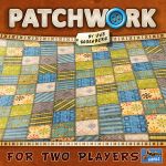
don't know anything really about kanban i know that vitala serda games i haven't played any of them but i'm told that they tend to be fairly complex uh european style games this cover is beautiful it's really really gorgeous gorgeously put together it's by ian o'toole the artwork here you might glance at this and not know what the game's all about you kind of have to look at it and think about it a little bit to work out that that's a car coming together from all these pieces but perhaps i'm being overly critical there i think this is excellent i'm going to call this an a tier number 99 on the list is rising sun by eric lang this one i really really like i really like the composition of it i love that that red um banner down the side there with that asian writing we've then got um the the the samurai type warrior there um and and then the faded out dragons and and monsters in the background it feels like a game that's going to be absolutely packed full of combat i haven't played the game i've no idea um what it's actually like it's i mean it just draws me in this makes me think yeah i i might give this a try sometime it's not really my style of game but i could see somebody who's looking for for heavy combat games really finding this appeals to them let's go with i think another eight here eight here for rising sun so next on the list then is patchwork patchwork by over rosenberg polyamino game for two players i really like the fact that it's very much advertised right on the box for two players that's the major selling point of the game so i
think it's great to get up there and center this is a great game for couples or um or just two people to play together i don't understand why it has to be so brown and actually patchwork has gone on to have a number of different editions with different artwork for halloween and christmas and so on i can't see why anybody would choose to play the game on the basis of this image alone i suppose we've got the the grid there that looks like the the tiles of a tile laying game and certainly it tells us that we're going to be making quilts or that it's a game about quilts but i'm not sure this cover is really it's not really working for me all that much i'm going to give this one a c seat here for patchwork number 97 is tigress and euphrates um this is the fantasy flight box cover which is i mean beautifully uh painted lovely image of the city and the river and and this this image of this man that's that's lovely too and the composition of the piece is great but in terms of telling me what i'm going to be doing and how i'm going to feel i think this is a little bit lacking really not really sure what it's telling me it just looks like quite a serious um game the guy standing there looks a bit passive a little bit bored yeah i'm not really getting much from it so let's look at the earlier edition this is the version i've got in my collection and this is a mess look at this what a horrible font that horrible yellow font we've got this floating sort of creature in the top left corner who's just in the middle of nowhere and then we've got these other bits of writing here and there ryan knits his name's
just sort of scrawled on at the bottom nothing seems to have its place uh the drawing is lovely but but very boring and and it gives me nothing of the feel of the game whatsoever this is proper d tier um cover for tigris and euphrates for the previous edition number 96 lorenzo ill magnifico and this is the first on the list with um clement's franz artwork and we're gonna find clement's friends who'll crop up several times on this list i suspect um so clement's friends i think of him as being the artist for agricola and uber rosenberg games but of course he does a lot more games than that this one's got this weird sort of puke green sort of color to it and this strange sort of paisley pattern i mean if i was being generous i might say that this looked a bit like some william morris curtains or something like that and then we've got this bored looking nondescript guy poking out the middle i'm assuming he's lorenzo whoever lorenzo is not particularly appealing doesn't tell me anything about what i'm going to be doing in the game this is a fantastic game i really really like it yeah this cover's doing very little for me even though it's you know really nicely drawn and that pattern's lovely um so i'm going to give this a seat here seat here for lorenzo magnifico odd to cover that one this is more like it number 95 eldritch horror okay i i i've never played eldritch horror i don't really like cthulhu as a theme it's never really particularly appealed to me but this cover knows what it's doing right
fantasy flight are excellent at putting together their board game covers generally speaking um so uh here we've got the man and the woman right in the center firing their guns right in the center we know who we are these are our avatars our in-game personalities um we got those bat-like creatures up in the top left and then that massive tentacled monster um it tells us this is gonna be a game full of action and horror the colors the highlights on it the the lights on the train it's a beautifully um put together a piece of piece of artwork there i've just noticed that little pyramid in the background this is all very intriguing i think this is a top-tier um estee cover fantastic eldritch horror so number 94 on the list is mumbasa mombasa is a complex strategy game from alexander fista i love this cover um this one i like that those curtains draped back the reds i like that big hat there and you know this one is one which is sort of in first person isn't it i assume i'm the person holding that that that feathered pen there writing this so whatever that character is doing that's me in the game i assume and then we've got this little um nicely framed picture of this uh this farmland and these workers out on this land now i know that this was a controversial game and a controversial theme because of the colonization aspects of it and actually it's being reworked re-implemented into a new game that's just recently been announced which is sky mines now sky mines has got a new theme where
presumably we're we're mining on the moon okay um so we've got our industrial equipment there and i i guess we're looking through a space man's helmet that's what the framing is here there's nothing particularly intriguing going on here and it's very dark um yeah i'm not getting much from this cover even though it's it's nicely drawn so i'm gonna call this one um seed here seat here for me for sky mines next up then where are we we're at raiders of the north sea i love the composition on this one i love that stripy sail at the top and then the the the title right across the middle and that mast going up the center i think it's nicely composed this one i think it's a shame that the people are a little bit far away okay because one of the big selling points of shem phillips games the the these trilogies of games is is the artwork by this artist what's his name the artist well it may not be a man i'm not sure miha mihad gilo mihat hilo dimitrievsky i've completely butchered that name i'm really sorry about my pronunciation but i think this is one of the best board game artists working in the industry right now and i think raiders of the north sea if we could have zoomed in a little bit on these these raiders i think this would have been a nest here but for now i'm going to call this an a tier really intriguing excellent looking tight cover i think there so next up after raiders of the north sea is lord of the rings
journeys in middle earth ah why is it so gray i'm not getting much from this cover apart from grey i mean we've got this image of i don't know who these characters are from lords of the rings they're quite familiar with lord of the rings but you know these could be anybody couldn't they they're just warriors and and orcs is that boromir or is it aragor i don't know i mean this could be a picture from any lord of the rings game anywhere um it's nicely painted but yeah this isn't really drawing me in i'm calling this one seed here nothing nothing special about this one i don't think so what's up next it's dominion intrigue i think this box cover is a mess i think it's a mess there's so many different colors in there um our central avatars are presumably this little huddle of people down there we're supposed to be intrigued by this there's some sort of conspiracy going on but that woman looks thoroughly bored standing there she's not even chatting to the other she's just kind of looking into the middle distance and i mean the the logo the dominion logo is kind of lost amongst all the busyness of the of the box yeah i don't like this one at all i mean dominion is not known for being a looker because it's got so many different artists involved and they all use different styles and things like that on the cards so it's a bit of a but this cover is a bad bad example of the dominion artwork i don't like it at all this is a d tier dominion intrigue so next up then is tua at number 90. so tua is a really striking looking cover again it's a
little bit brown and i could see this really turning some people off i like it it's so distinctive and so medieval that's what the game is like as well it's all it's all drawn in this style it looks like nothing else no other game it looks like it's something taken off the bayer tapestry or something i could see why this puts people off i'm not sure it's a huge commercial the best commercial move to use artwork like this but for me it makes the game really distinctive gives it loads of personality i really like it i'm going to call this one bt because i think it lacks commercial appeal so i think there's a couple of different twilight imperiums on the top 100 if i remember correctly this is the third edition it's a fantasy flight game again this cover's got it all hasn't it it's got epic space uh spaceships it's got aliens in there it's got that that lion so a bit of fantasy i guess and the sun shining out behind beautifully composed tons of stuff going on in this massive box it really cries out you're going to have this epic space opera experience i mean this one works for me it's not a game i think i could ever see myself playing frankly because of the length of it in the complexity but the cover yeah it's really good um i'm gonna say this is uh a tier eight here for twilight imperium third edition so next up then uh battlestar galactica the board game another one from fantasy flight games beautifully painted um now this one you know you could just use screen grabs of course for these sort of
these sort of games and it hasn't but games with intellectual properties they look so much better when they're painted nicely like this and fantasy flight always does this that lovely red color in the background the spaceships the composition of it's great i think this one is a strange sort of cover because it very much leans into the intellectual property like it assumes you know these characters you need know that program and as a result hasn't aged all that well because battlestar galactica hasn't been on the tv for what 15 20 years i guess and and so now battlestar galactica the board game is known more for being a really good hidden traitor sort of secret um secret hidden persona sort of game with those silence characters who might be working with you might be working against you and this cover doesn't give you any of that okay it just purely ties into the tv series and so i can't give it an est here for the because of that okay i think when it first came out i would have said s t because you know it really does bring the the the atmosphere or the personality of the individuals but not so much the theme of the tv show so i'm going uh bt for battlestar galactica the board game number 87 is chaos now this is a bit of a notorious one for having terrible covers and actually this first cover that we've got here with this strange sort of color palette you can sort of see a castle at the front but then these are they are they statues what are they they're ghosts i'm not quite sure what they are in the background um the game is about building a castle i think i think i recall it's
been a while since i've played it um i'm not getting anything from this cover this looks boring really boring um yeah i don't like this cover at all so i would go deep here on that one but it could be worse we could we could have the previous edition with this incredibly bored looking man standing at the front here um in this sea of blue now i've often said you know that a board game cover should tell you what you're going to be doing but most importantly how you're going to feel if i was going to feel like this play in this game i don't think i'd ever open that box this is d tier about as bad as it gets for kayla's there so next up is cascadia at number 86 so this is a very recent game very popular game right now from aeg and flat out games illustrated by beth sobel who makes lovely artwork often of nature and things like that nonetheless i think this covers boring um i'm not quite sure where my focus is supposed to be i assume i'm not playing as that stag i haven't actually played cascadia although i've seen reviews i know roughly what it's about i'd like to play it but not on the basis of this cover nothing wrong with the artwork it's just where's my eyes supposed to go what's this what's it telling me it's just telling me it's a game about nature there's lots of games about nature why should i play this one yeah i'm not getting much from this this is a real middle-of-the-road seat here yeah it's a seat here for cascadia next up then is el grande at number 85
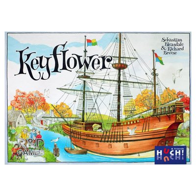
from the same school of design as um as kayla's with these bored looking chaps on the cover i mean i really like the font of el grande uh written on there um i've got much more positive to say about it than that this is a fantastic area majority game well worth your time and really really need to reprint with some more attractive more modern artwork because this is not doing it this is deed here okay number 84 is key flower this one i struggle on a little bit i like it it's colorful it's odd it's distinctive it fits in really well with the rest of that key range of games so you're immediately going to spot it because that's one of richard breese's games you know this ship coming in here right up in the center that's what the game's about really a ship that that produces new workers for you and they come and they work in your villages um and and i get that feel from it i could see why some people might not go for this game it looks a little bit like a picture book almost a little bit childish in a way a little bit naive um but i like it i think it's distinctive so i'm gonna go beat here for key flower okay number 83 ah this is more like it this is architects of the west kingdom i talked previously about raiders of the north sea um architects of the west kingdom takes that that that sort of model i liked what they did with raiders north sea but this is better yeah that really nice red orange background the
figures right up centers looking us straight in the eyes stern you know there's some real attitude going on there the scar on the face of the the knight and on the right-hand side but yeah the castle with the scaffolding all around it um this is this is good stuff i mean this is just the hallmarks of a euro game isn't it but but actually making that look exciting and engaging by looking us in the eye and inviting us in this is esther stuff really good stuff this artist the one whose name i can't pronounce um fantastic brilliant brilliant artist and and the composition on this is stunning love it number 82 is a game that i haven't really i don't even know if i've heard of it i've probably heard the name i don't know what it's about tainted grail the fall of avalon so here this is all very dark it's very grey but we've got those flames that's quite striking those flames in the middle and there's a sword which initially i thought was a sword in the stone but it's not in a stone is it it's a sword in a corpse or a sword in a cadaver i'm not even sure he's got his head anymore um and he's on fire and then there's death standing over him i don't know whether it's a statue of death or whether that's actually death this is grim isn't it this is grim stuff beautifully painted and it's really really dark just like black i don't mean dark in terms of the subject matter although that clearly is dark um i think it's beautifully done doesn't appeal to me it's not to my taste and i don't like the way the the writing
sort of disappears into the background because that's really dark as well i'm calling this one beat here be here for tainted grail whatever that is i doubt i'll ever find out 81 is grand austria hotel this uses that classic lookout spieler um mayfair framing where we've got that empty blank space at the bottom that does nothing don't know why it's there we've then got the clements fran's artwork in the middle uh and then another sort of framed bit on the top with the title getting a little bit old hat this stuff now it does immediately cry out this is a lookout speeder game and actually the clement's friend's artwork says this could sit alongside agricola and other games by uber rosenberg um i'm assuming the guy in the middle with the bottle of wine i'm assuming that he is our avatar he's our in-game character that's who we're going to play but it's all a bit passive isn't it it's not particularly interesting what we're doing there i love this game this game is amazing okay he's running a hotel and i suppose we do at least get that from it so it does tell us what we're going to be doing i'm not sure it tells us how we're going to feel playing the game um so i think it's all right it's okay this is a b tier b tier for grand austria hotel number 80 dominant species i don't like this cover even though it's one of my favorite games of all time i'm guessing that font is supposed to be blood um what's the saying blood in tooth and claw red in tooth and claw something like that i guess that's what they're going for i do like that this is a game about
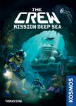
evolution and everything's very pointy and sharp sharp teeth sharp beaks everything looks vicious and i really like that my favorite game is evolution and i'm not so keen on the cover of evolution i think it's beautiful but i don't think it fits the style of the game because actually evolution is a pretty nasty mean spirited game lots of attacking and you don't get that from the cover you do get that from the cover of dominant species you've even got that real sort of looming volcano in the background saying peril you know but ultimately it's all a bit green i don't like the composition of this very much it's not very inviting i don't like the font um yeah this box doesn't work for me particularly well i'm gonna say seed here for dominant species the crew mission deep sea so i don't know if this is this the first crew or the second crew i'm not sure this is a great cover really really good i mean it's just trick taking game is of course the the artwork means nothing really but i really like the fact we've got our avatar up front and center we know who we are we're this deep sea diver the one with the bulb i like that bulb that draws your eye the composition of it's lovely and it's juxtaposed with the the jellyfish in the other top corner we zoom in on that bright blue underwater scene i like the theme of this that it's deep sea diving and exploration rather than a sort of um underwater civilization like like abyss or something like that i don't know i haven't played the game um so maybe maybe it has got some of that going on but yeah this is this is great this is a really gorgeous cover i'm going to go
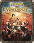
est here for the crew mission deep sea number 78 lords of water deep i like this cover i like this one this is uh i like the frame around the outside and actually that extended down the sides of the box and the box had this unusual shape to it which was really good it's a game set in the dungeons and dragons world and so yeah our characters at the front there are very generic but then that is what dungeons and dragons is isn't it generic sort of fantasy archetypes um looks like we've got a wizard there and a warrior and i don't know is that another wizard i'm i'm not sure i like the color i like the composition i'm going uh eight here for loads of water deep nice cover number 77 is agricola the revised edition okay um i find agricola a disappointing cover it's it's again it's that lookout spieler thing of you know empty space right at the bottom for no reason this horrible sort of orangey yellow color at the top i don't know what that's all about that's not a pleasant color at all is it and then our avatar he's not even on the front of the box it's on the side of the box the farmer with the the trident so i guess we could maybe assume that we're the woman but she's really small and sort of off center you barely even notice her she sort of blends into the building in the background if you just looked at this cover alone and you didn't know about the guy on the side of the box you would assume that in game you're playing as that sheep that this is a game about farming seen through the eyes of a sheep
it looks boring it's an ugly color i don't get it don't get it i'm going with um seed here seat here for agricola revised edition let's have a look at um the new version so this one's just been announced agricola 15th anniversary or agricola 15. um here we've got our avatar right front and center i'm assuming it's the guy with the pitchfork not the not the sheep below the 15. and i do like this carved wooden thing around the edges there i think it's pretty i think it's a bit big like it takes up a bit much of the box and makes it all look a little bit brown but it does sort of focus in your eye on that agricola logo i like the way agricola's written in this one i think it's quite nice quite nice a bit too brown i would have toned down the brown a little bit but this for me would lift agricola to uh probably a b tier if it had this cover which is going to soon enough right next up on the list is number 76 seven wonders yeah this one's excellent okay i like the colors the color combinations the title itself is so evocative you know it's such an iconic thing the seven wonders of the world and then we've got images of those seven wonders around there with that statue up at the center um yeah it's lovely really really good this is how a civilization game should look you know again a proper civ game should have a cover like this um i think this is st 7 wonders i think it's an excellent example
of what you can do with a board game cover i bet this has sold a lot of copies of the game just this cover alone right 75 is the voyages of marco polo okay i mean this is old school isn't it it's not even that old game really it's a few years now but composition's okay you know we got that big guy i guess that's marco polo himself he looks a bit bored doesn't he doesn't make me go oh i really want to be that person it's got this pretty insipid orange color to the box again and then if this is the theme of the game at the bottom there it looks like it's all about travel with camels don't even get to ride the camels and it's not as exciting as camel up is it yeah this all just looks a bit boring and it's a really good game really fun i'm not getting it from this cover though this is c tier the voyage is marco polo it's 74. this is a good one good cover not a huge fan of the game got to say but i love the cover to five tribes days of wonder do really good box covers what i really like is we've got our avatars there you know you look at it and you go oh maybe i could be that that woman there with her with a knife and and the veil you know it looks looks intriguing or i could be the guy with the turban on the bottom right hand corner okay or or maybe the guy in the back with the crook and the long beard it tells you you could be all these different characters play these different parts we've got this arabic sort of building in the
background the colors are beautiful it's framed lovely oh this is a really really stunning stunning cover um this is ester s2 yeah really makes me want to play the game and i don't even like the game all that much so number 73 is tayatoakan uh i'm trying to pronounce that as best i can tell straight so fast so you don't notice ted how i can city of gods um by danielle tashini i like the composition of this one um the colors uh are really sort of pale i like but i like that teal and beige combination there with the the green sort of pops and the red pops in the bottom uh corner of it i i guess this is about building monuments i don't actually know what this game is all about i know it's a quite a complex euro game um it's not making me desperate to play it because i mean it's not the most fascinating theme in the world but it is beautifully illustrated and that gives me more confidence in the quality of the game that's inside um so i would say this cover is a a bead here okay it's it's it's as good as it can be with a fairly dry looking theme i think number 72 is robinson crusoe adventures on the cursed island and there are two different covers to this one as far as i'm aware so this is the first cover this is the cover that was on the first edition i think so it's a lot of brown again but i like this it's all very wooden looks like very piratey and this isn't a pirate game so so maybe that's why they changed the cover but as we've got the the ship's
wheel in the writing and the telescope and the compass that's great in the candle i really like the font and how everything's written robinson crusoe and then the image we've got our avatars up there and they they look like they're exploring and and their clothes are all sort of ragged and the other cover the more recent one i don't like as much actually i like the idea of it so in this one we've got these two sort of pillars down the side i guess i guess we're looking out from inside a cave and they're carved into the stone we've got these these uh snake and skulls and faces and then creeping up there on one of those ledges there's this panther um i guess coming out ready to attack these shipwrecked people but to be honest this is this looking at this now is the first one i've ever noticed that panther okay sort of dark and hides in the background there i don't like the font on this one um i don't find this as attractive or intriguing as our browner piratey cover so brownie piratey cover i'm going to call um atia and then this more blueish cover i'm going to call beat here for robinson crusoe so next up is number 71 and that is fields of al another uber rosenberg agricultural game i think this is dreadful this cover really don't like it it's dennis lohausen's artwork and dinosaur hasn't done some lovely uh in some of these games but this one's a real hodgepodge i don't know what's going on
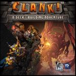
with that cow on the bottom left it looks like it's got six legs it doesn't have six legs what it actually is is one cow standing in front of another cow but they're so sort of side by side that you don't notice that unless you look closely so it just looks like a really oddly shaped cow which wouldn't be surprising because that man's really oddly shaped as well he's really sort of is he a hobbit um and then all this blue is just like why are we looking at a game where we can just see loads and loads of the sky i'm convinced i would really like this game it's an agricultural game by uber rosenberg you know i i love that sort of stuff but this cover goes a long way to putting me off playing the game i think this is detailed it's really really badly put together this cover um so yeah that's a shame field of art like seeing re-release with a better cover number 70 is clank a deck building adventure i've never played clank but i'm really intrigued to play i like deck building i like the the theming of this one i've heard so much good stuff about it top half of this i like i like the way clank is written i think it looks really good that's a really striking logo up there really like that and actually the image below is good too but you've got to look closely to kind of work out what's going on the dragon is a little bit washed out the colors um and then you barely notice the orcs and goblins down on that lower sort of level so and then it's quite busy the the the artwork around these thieves these burglars stealing gold from this uh this
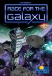
dragon but actually if you look closely it's really nicely drawn i like the sort of peril there the rocks falling away the sort of panic on the face of the woman as she sort of clutches that treasure chest and it really does look like it reminds me of um the balrog and and and the minds of moria in in lord of the rings um cross crossed with the hobbit of course um yeah i i'd just like to see some of that blown up some of that oh we're blown up so we get to see our avatars a little bit more but it captures a lot of what i imagine the feel of the game is so number 69 is race for the galaxy um this cover tells me that it's sci-fi there's a space station i don't actually know what i'm doing in the game so nice composition i'm going to give it a b tier for um race for the galaxy number 68 is pandemic legacy season zero pandemic knows how to or the makers of pandemic know how to make a board game cover this is stunning really stunning and there's a lot of brown in this and i'm normally i'm moaning about this but i love this one so we've got this woman she's burning this bit of paper why is she doing that why is she doing that i want to be that person burning that bit of paper i don't even know why and then we've got the person behind there with his sunglasses on his hat obviously in disguise what's he all about and the person behind with the suitcase running away from a wolf fantastic then this clock motif in there it's really intriguing looks like it's time travel or something like that pandemic has become a bit of an iconic
sort of logo the writing for pandemic there and even that legacy pandemic legacy has become quite iconic now the horizontal box is really sort of eye-catching because we've got so many vertical boxes in this hobby i think this is stunning esteem yes it really makes me want to play it and i i'm not a big fan of pandemic games next up is android netrunner and number 67 again a very gray box but actually i quite like this one i feel like it's going more from metallic than gray maybe um and i think it color in the image really lifts it there's so much color in that image but it's not overly busy um fantasy flight just knocks out the part with these covers um we've got a minority report sort of thing going on here moving around these screens lots of technology i get a feel for what i'm going to be doing in the game i'd like a little bit more emotion on the face of this woman i'd like to know what she's feeling and it's all very passive but it's beautifully beautifully drawn and it does capture the feel of the game um because that's what android network is all about is computer techie stuff isn't it hacking and all that right next up then number 66 is through the ages a story of civilization don't like this cover at all reason i don't like it um i think it's overly busy messy overly colorful i think when you start putting images of queen elizabeth the first and einstein and all these other people on the on the cover there it starts to look a bit like a history book starts to feel quite educational yeah this really really isn't working
for me far too busy i'm calling this one a d-tier one of my least favorite covers through the ages really bothers me this one next upload number 65 is aeon's end or eon's end now i haven't played this i don't know anything about aeon's end but i do like this cover i think it's um you know that monster is quite striking in the center there lit by that sort of halo behind them of the sun or whatever coming through and then you've got this crowd of of people fighting this monster that makes me think that this is a cooperative game because you know how could it be competitive we're all fighting the same monster we're all working together against that monster i assume um and let me have a little look so if we get into it it is indeed a cooperative game so yes that cover tells you it all okay that's what i mean a cover that tells you what you're going to be doing how you're going to be feeling and it doesn't have to be literal just just it can get you there with the with the little hints the little clues and this one does it well it makes me want to play it even though i know nothing about what it's about you can tell me is it worth me playing you know my taste right you've seen enough of my videos now would i like aeon's end i i might find out next up number 64 are perfect paladins of the west kingdom so paladins of the west kingdom i mean this just builds on the architects of the west kingdom again and and does it just as well all over again even without
you know architects of the west kingdom the thing that i was saying was great about it was the fact it's looking you in the eye and drawing you in here we don't even have the eyes of that central avatar they've got their their um their helmet on and even the helmet seems to have sort of bloody scars on it and then we've got the face of the person on the right hand side and that's a fairly androgynous figure is that is that a woman is it a man i i guess that could be a woman maybe it's an eowyn type character a joan of arc type character and then we've got our warriors all down at the bottom there and even they've got different personalities despite their helmets we've got the one raging with his with his axe in the air you know victory are stunning stunning and the red color recalling the whole trilogy yeah brilliant i love it estear absolutely love it paladin's i haven't played the game but i love the cover as all here's another s tier game okay s tier cover that i would say um with all these uh all these tiles these colorful tiles that's what the game's all about isn't it the colorful tile pieces and so there's nothing more you could say about it it's an abstract game an abstract strategy game so making it look this attractive it's a really good move it really draws the eye it's it's been mega successful this is an s-tier cover it just looks slick and modern and uh and just excellent excellent cover next up then is eclipse so eclipse i do like the composition of this one i like the logo i like the little solar flare or whatever it is where you've got
that line for the eye in the middle there i like the the arc of the sort of sun peering out from behind a moon or a planet there um we can see there's some magic going on with that woman down at the bottom there and the aliens so it looks like there's something quite mystical and i guess combatty about it i don't think it's all brilliantly drawn uh in terms of the the characters on the right hand side but the composition of it just makes up for it it's quite intriguing for a sci-fi game i think this one would would attract me i'm gonna go beat here for eclipse so this brings us to lisboa at number 61. i don't know what's going on here liz bower another game by vital asurder so i haven't played it i don't know what the game's about very pale blue and beige we've got three characters who maybe are avatars down there i don't know we've got a king and a couple of other courtly looking blokes some statues i guess this is about building a city an ancient city i don't know looks dull doesn't it tells me nothing absolutely nothing it's not helping me don't like this one d tier for liz bower whereas number 60 the gallerist also a vitality game this one is pretty stunning isn't it look at all those that color and it's called the gallerist so we know it's about art galleries i assume some sort of modern art face going on at the top there i don't know whether i'm a painter or i guess i'm not i guess i'm a gallerist so i'm running an art gallery um
sort of intriguing really i like this really stands out and yeah it gets me intrigued makes me think i'd like to play it i'm going to go aid here for the gallerist number 59 we can ignore because this is crocodile so crocodile doesn't actually have a classic game cover quacks of kwedelenburg this is dennis lowhausen at his best i've previously been quite critical of feels val but this is a really good cover by dennis lohausen we've got our avatars down there it's a bit busy so it's quite hard to work out who you're supposed to be but i assume we are um either the woman on the left with her potion reaching out there or with the competing sort of wizardy character on the right with his long beard with his potion um and it all looks a bit grimy with the crows flying around and all that sort of thing yeah a bit busy um but nice whimsical picture book sort of feel which is what the game feels like as well i think this is quite a good cover i'm going to say beat here for quacks of quedlinberg number 57 is the seventh continent this is one of those games which has decided they don't even need to put the name on the box and you get away with that on kickstarter don't you because you've got so much other context and narrative driving those purchases but i look at this and all i'm seeing is a yellow skull with hands it looks sort of spooky it's quite stylish but i don't know what the game's about and the thing is i do know what the seventh continent is about it's about storytelling it's about choose
your own adventure turning over cards that give you choices i get none of that from this box so striking iconic design but really really relies on on people sort of reading other stuff this you wouldn't get away with this on a game store shelf maybe maybe on kickstarter i'm going to say um c tier c tier for the seventh continent 56 is la havre love i don't know how to pronounce it and this is another lookout to be the mayfair one with that horrible border at the bottom um the border at the top real zoned out zoomed out art style like on agricola our central avatar i guess is the guy carrying the the crate he doesn't look like he's having any fun does he i don't want to be that bloke the dog doesn't even look very happy i would be quite happy to be the bloke leaning around at the background but you've got to look quite closely to see him this isn't doing it for me this isn't making me think oh do you know what i really want to play that game and it's a great game so it's such a shame that it doesn't draw you in yeah this is not a good it's not a good cover the best i can say about it is it does at least place itself in that world of hoover rosenberg look out spieler games you you spot the clements friends artwork straight away and you recognize what it is deed here for the harvard and next up number 55 mix versus minions haven't even bothered they put all their effort into the components inside this box the outside of the box what is this
i don't know what this is i don't know the video game it's based on it's going to be about mechs it's going to be about minions i don't know anything else about it from this box cover all right and i do know a little bit about the game all right i know that it's a programming game and a cooperative game i believe um i might be wrong there but anyway this cover's not doing it hasn't even bothered to show up i think this cover this is a detail yeah i find it a bit irritating number 54 this is how you do it star wars imperial assault we know exactly who we are we're these rebels with their guns or we're that jedi on that platform with our lightsaber we've got darth vader up there the peril beautiful colors beautiful composition these artists are stunning these artists that work for fantasy flight um and this star wars art is so evocative absolutely love it estea estia tells me exactly what i'm going to be doing in the game next up then number 53 do i need to say anything about this kingdom death monster what is this this is just a black box i mean this is going to people are going to look at this on their phones shrunk down into a tiny box it's just a black square okay yeah there's some sort of image in the background but i can't even tell what it is is it tentacles i don't know i mean this is rubbish absolutely i haven't played the game but the the box is just making me angry detail put your name on the box for goodness
sake right number 52 and move on quickly good good we're back on even ground on mars another vitala serda game with artwork by ian o'toole oh vitalizer and here though tool they come up with good box covers on mars this is stunning who would put red and green together you wouldn't think red and green would go nicely together but they do and we've got a nice glowing red sort of thing light bulb in the corner that looks great we know that we're presumably this space man standing in the middle there with this bright blue helmet which really stands out um i like the the text on it the way that that's sort of superimposed over it it looks great really really good really stylish and modern and exciting on mars stf excellent cover excellent and that leaves us with number 51 last one on the list are we going to end on a high no we're not we're ending on clans of caledonia which is very green looks like it's got the the guy from uh isle of skye who's wandered out of that cave and wandered onto this one in his tartan kilt because they're both illustrated by clemens franz i suppose and of course we've got the woman with her tarpon dressed as well i mean at least i know what i'm going to be doing in the game i'm going to be sheep herding and cow farming and making whiskey and gathering milk and maybe making huts there's a little mine there in the background as well so i know what i'm going to be doing but it looks so green and and
yeah this this is why would i play this over any other agricultural game agricultural euro game i i don't know i don't know reputation alone that's the only the box cover is not doing it is it the box cover is not selling the game this for me is a seed here clans of caledonia and so that brings us to the end of our top 50 from the board game geek um top 100 and in part two we're going to be looking at numbers 50 through to number one and considering their box covers if you've made it this far then perhaps you'd enjoy some of my other videos on the channel so please subscribe comment let me know where i was wrong let me know where i was right let me know which of the games that i clearly haven't played i should be playing and i'll see you next time all the best